Maybe I was inoculated by low expectations, but I expected to be more annoyed by the Trudeau government’s new passport design. Instead, I was just nonplussed. My first reaction was that it’s too boring to be angry about. Of course it’s bad, but honestly I was expecting worse. I was almost relieved when it turned out to be just offensively inoffensive, rather than actively offensive.
The other reason the launch left me more deflated than infuriated is the nagging feeling that Canada now has a passport that suits the country we have become.
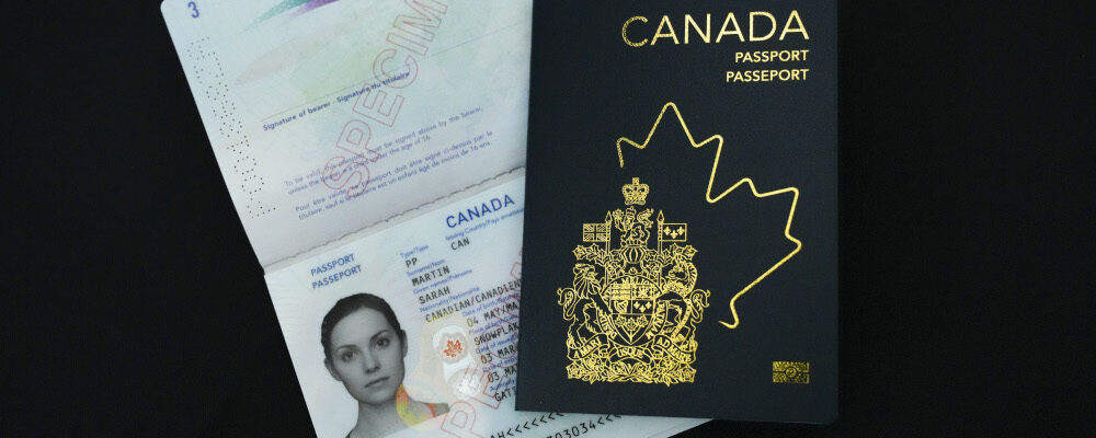
Start with the cover. The coat of arms that has graced Canadian passports for decades is still there,1But only because this government couldn’t manage to align its redesign of our national symbols, so the newly unveiled “snowflake” crown came too late to be included in the passport. but it’s shunted into a lower corner and framed by a stylised modern maple leaf that appears either to be emerging from or hiding behind it. In the opposite corner, the words “Canada,” “Passport,” and “Passeport” are stacked uncomfortably in that ungainly way typical of right-justified text.
It’s a cover that hedges its bets. A bit of old, a bit of new; no choices, no commitments. It is a passport for a country that is vaguely embarrassed by who we were, doesn’t know who we are, and can’t decide who we want to be, designed by a government so afraid of giving offense that it ends up with nothing to say.
Inside is no better. Gone are the finely-drawn images of Canadian history, natural and man-made vistas, and great Canadians. Gone are Confederation, the Vimy Memorial, the Korean War, and the Grey and Stanley Cups. Gone are Halifax Harbour, Citadel of Quebec, and the Peace Tower. Gone too are Samuel de Champlain, Billy Bishop, Terry Fox, and Nellie McClung.
I expected some of these changes, but I did think the Liberals would keep at least a few of the old images while adding a few of their own. Canada has no shortage of worthy places—Gros Morne National Park, Algonquin Park, Moraine Lake, Chesterman Beach—persons—Alice Munro, Glenn Gould, Oscar Peterson, Chief Crowfoot, Gabrielle Roy—or artists—Bill Reid, William Kurelek, Benjamin Chee Chee, Emily Carr, Jean Paul Lemieux—on which to base new pages.
A rotation through national icons would have been understandable and reasonable, even if it meant a little more of Pearson’s and Trudeau’s vision of Canada and a little less of Borden’s or Harper’s. Instead, the new passport art gives the distinct impression of having been workshopped by committee into banality. The government’s instructions to the design team might as well have been: blander is always possible.
If the minister really wanted to be daring, she could have commissioned an active artist to design a new passport. We actually used to do that sort of thing when we were a younger, more ambitious country, brimming with self-confidence. Canadians of a certain age will remember the centennial coins designed by Alex Colville in 1967, which circulated well into the 1980s, their stark animal designs adding numismatic variety to dresser-top change jars.
But that would require vision, which is not something this government—if I’m being honest, this country—has much of anymore. We are parched for confidence. Instead of vision, we get visuals, and on that front the new passport delivers … at least if you hold it under ultraviolet light (remember to bring your passport to the next rave, I guess?). I wonder if a generation raised on flashy technology in a country that no longer teaches history recognises the difference.

I’ve seen it reported that the new passport shows “more nature and less history,” but this isn’t quite true. There is no actual nature in the new design. There is nowhere that is recognisably part of Canada or even recognisably real. There are only stylised images of generic seasonal imagery. Any hint of an identifiable place, substantive history, or meaningful symbolism has been scrubbed from the pages by multiple rounds of gimlet-eyed bureaucratic scrutiny.
We are left with simplified scenes of the northern lights, a pumpkin patch, bears in a forest, children in the snow, a canoe on a lake: pictures that could be anywhere, but are in fact nowhere, populated by figures that could be anyone, and are thus no one. It’s all colourful superficies and carefully curated insignificance.
Yann Martel hit a nerve a few years ago when he described Canada as “the greatest hotel on earth.” He meant it as a compliment to a country that “welcomes people from everywhere,” but a man who earns his living peddling words should have chosen his better. An hotel is not a home. At best it’s a place to make a few memories; at worst it’s a refuge for the sort of transactional relationships that prefer anonymity.
The new passport looks like it was designed for such a sterile country. It’s a passport of convenience for a country of convenience, an electronic key to Hotel Canada.
Ok, now I’m angry.